If you’ve ever thought about getting a new website, you’ve probably heard that “the homepage is the most important part”. But what makes a homepage good? What should be on it? What is the right content order? And how do you know whether the visitor will understand what you do within a few seconds?
In this article, I’ve collected the core principles of structuring a website homepage in a clear, structured way.
The goal is to help you understand what a modern, convincing website needs – even if you’re not familiar with web development or UX.
Why is the homepage so important?
Your homepage is like the entrance to a store. This is where it’s decided whether the visitor comes in or walks away.
Within a few seconds, the user decides whether they:
- are in the right place,
- understand what you do,
- are interested in what they’re going to see,
- trust you,
- and whether it’s worth clicking further.
That’s why the homepage is not just about nice images and design, but about a deliberately built journey that guides the visitor from first contact all the way to getting in touch with you.
This journey looks like this:
- They immediately understand what you do
(hero → brand positioning → main message) - They can easily find what they’re interested in
(featured categories → thematic entry points) - Trust and professional credibility start to build
(about section → USPs → client logos and testimonials) - They see real examples and inspiration
(use cases, references, projects) - They get a fast, clear path to conversion
(quotation process → CTA → contact) - They feel that the company is active and up to date
(news → blog → newsletter)
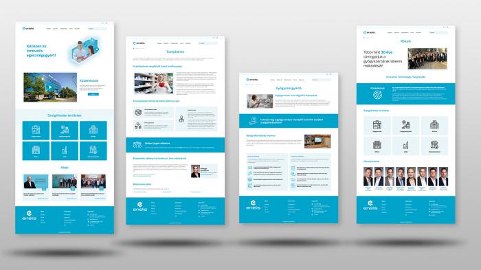
The main elements of a homepage from top to bottom
The following homepage structure helps ensure that the visitor step by step understands what matters – and can easily get in touch with you at the end of the journey.
1. Header
The header is the very first and most frequently seen, persistent element of the website. It’s the only part that appears on every page, so it has huge strategic importance.
The header has 4 key roles:
1) Navigation — guidance and orientation
It shows the visitor where to go:
- where to click if they want to know more,
- where if they want to get in touch,
- where if they are interested in a specific service or product.
This is why it must be logical and clean.
2) Branding – visual identity and trust
The logo and colours in the header provide the first visual impression. Within seconds, people decide whether:
- the company looks professional,
- the appearance feels modern,
- the site seems trustworthy,
- it feels good to be here.
This makes the header one of the earliest tools of trust building.
3) Conversion — leading to the primary CTA
The header should always contain a primary conversion element:
- Request a quote
- Book an appointment
- Contact
This is important because a large percentage of visitors never scroll down. If there is no CTA at the top, you lose them.
4) User experience – comfort and ease
A well-designed header:
- looks consistent on every page,
- works well on all devices,
- is not overloaded.
The visitor should enjoy using it → this has huge UX value.
What should you include in the header?
- Logo – visually identifies the brand and, when clicked, leads back to the homepage.
- Main navigation – structures the website. Ideally 5–7 main menu items, such as Services, About, References, Blog, Contact.
- Primary CTA button. This can be Request a quote, Book an appointment, Free consultation, etc. It should be always accessible, visually highlighted and enable an immediate conversion.
- Contact details. Phone number, chat, email, social media links. Not mandatory, but recommended to make contact as easy as possible.
- Secondary elements: search, language switcher, sign up/login, cart (for webshops).
2. Hero section
The hero section is the first visual block that visitors see on the website. In marketing, this is called the “attention grabber”, because it:
- captures attention,
- sets the mood,
- positions the brand,
- immediately communicates what the company does.
The headline and button in the hero section determine:
- what the visitor understands about the business,
- how quickly they find the most important action,
- which direction they go next.
This is the part where an interested visitor:
- understands how you can help them,
- and instantly gets an opportunity to take action (e.g. “Request a quote”, “View our services”).
A good hero section reduces uncertainty: “Okay, I’m in the right place, I understand what they do.”
What should you include in the hero section and why?
1. Large, high-quality hero image or background visual
- Creates the first impression and sets the tone of the website.
- Visually shows the field the company operates in.
- Helps the visitor understand what’s going on in 1 second.
2. Short, clear main message (1 sentence)
- This is the most important element of the hero section.
- This is the so-called value proposition that answers three core questions: What does the company do? Who is it for? Why is it good for me?
3. A strong CTA button (Call To Action)
- The hero section must always include a visible, clearly clickable button. Examples: Request a quote, View our services, Book an appointment, Free consultation.
- Why is it important? Most visitors will decide here whether to click on something. The CTA is the first step in the main conversion path. If there’s no button here, you’ll lose many potential leads.
3. Featured categories
This is the second most critical section after the hero. Its job is to immediately lead the visitor to what they’re interested in – without unnecessary clicks.
Its role from a marketing, sales and UX perspective:
Visitors often don’t want to browse for long. If they see the main categories right at the top, they feel that:
- it’s easy to find what they’re looking for,
- the company communicates clearly and logically,
- the offers are relevant to them.
This increases satisfaction and reduces the bounce rate.
Categories are like large direction signs in a store. They help the visitor reach the product or service they’re likely to purchase in the shortest possible time.
If the visitor quickly finds what they need:
- they are more likely to convert,
- they spend more time on content that matters to them,
- they’re less likely to go elsewhere to look around.
The user should feel: “Okay, got it. I know where to go next.”
What should you place here and why?
- 3–6 main categories (with image + short label + button) such as:
- main service areas,
- product groups,
- use cases.
4. Inspiration and use cases
This section shows what your service looks like in practice, and how it connects to the visitor’s real needs.
The goal of the inspiration block is to make the visitor feel: “This is exactly what I need.”
It helps them:
- visualize the end result,
- form an emotional connection,
- feel inspired (“I want this too”).
Most purchase decisions start on an emotional level — this section activates that.
Inspiration blocks are like “demos” in sales:
- they show how a service works,
- they prove that the company delivers real projects,
- they reduce the perceived risk (“they’ve done this before”).
If the visitor sees an example that is close to their own situation, the chance of requesting a quote increases.
What should you place here and why?
- 3–4 inspiration or use case blocks, each with a large image or strong visual example,
- a short title and one-sentence description,
- in clickable format, linking to detailed reference or project pages.
5. About us / Why choose us?
This is one of the most important trust-building blocks on the homepage. Its goal is to quickly, clearly and convincingly show who is behind the service and why the visitor should feel they’re in the right place.
This is where you clarify in one short text:
- what you’re good at,
- what makes you different from your competitors,
- what value you deliver.
This is essentially your mini brand promise. If the copy here is strong, the entire site will feel more credible and confident.
The purpose of the about block is to create an initial level of trust. That’s why it’s powerful if you summarise in one short message:
- what experience you have,
- how solid your professional background is,
- what level of quality and reliability clients can expect.
A good about section says: “We are a reliable partner who delivers what we promise.”
What should you place here and why?
- A very short introduction (1–3 sentences). It should be concise, concrete, quietly confident and client-focused. It explains what you do, since when or with what kind of experience, and what your key strengths are.
- 3–4 well-worded USPs (unique selling points) with icons. Icons make the content more visually digestible, increase clarity and support quick scanning (understanding in a split second).
- Optionally 1 trust-building fact or metric, such as years in business, number of completed projects, ratio of returning clients, professional awards or certifications.
6. Client logos and testimonials
This section is the strongest and fastest-working trust-building element on the entire homepage.
Visitors want to see that others have already trusted you. Client logos and quotes convey:
- “We’ve already proven ourselves with these companies.”
- “We work with well-known, trustworthy brands.”
- “It worked for them, it will work for you too.”
This boosts credibility and perceived status.
Logos and testimonials:
- reduce fear (“this isn’t a gamble, they’re pros”),
- support the decision,
- prepare the conversion.
Especially in B2B, this is a critical element: if the visitor sees that other serious companies are clients → it’s much easier to decide.
What should you place here and why?
- 6–12 client logos in a grid layout. This way they are easy to scan, break nicely on mobile and create a balanced, clean visual appearance.
- 1–3 short testimonials (quote + name + company). These should be brief, no longer than 1 sentence. Testimonials are more personal than logos and convey the experience better than any marketing copy.
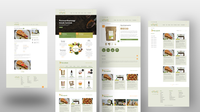
7. Most popular products or services
This section is the “shop window” of the homepage: it gives a quick taste of what you actually offer — and helps guide the visitor to content that’s relevant for them.
This part answers:
- which products/services are the most popular,
- what is special about what the company offers,
- why it’s worth exploring further.
From a marketing point of view it’s simple: whatever you highlight here will be perceived as important → the visitor will also see it as important.
Sales role: accelerating decisions. Many visitors come with a specific need. If they find it right away:
- they have to search less,
- they reach relevant content quicker,
- the path to requesting a quote is shorter.
This section is basically saying: “These are what most people choose with us — these will probably be the most interesting for you too.”
What should you place here and why?
- 3–6 cards featuring your key products/services. These can be your most popular products, your most important services, strategically highlighted offers, a new development or client favourites.
- With large, high-quality images to support quick understanding, visual confirmation and curiosity.
- With a short title + one-sentence description. The title should be concrete and clear, while the description should be short (ideally within one line). This helps visitors understand the point even if they only skim the section.
- With a CTA button: “Details” or “View more”. A clear button supports familiar navigation patterns, guides the user and moves them further along the conversion path.
8. The quotation process
This section is important because it reassures the visitor, explains how the purchase, quotation request or registration works and thereby reduces uncertainty. The simpler and more transparent the process appears, the more likely it is that the interested visitor will actually request a quote.
People like to know what will happen. Describing the process sends the message: “There’s nothing complicated here, it will be clear and simple.” This reduces fear and increases trust.
Quotation requests are often left unfinished because the person doesn’t know:
- what exactly they need to do,
- how long it will take,
- what to expect after submitting the form.
If the process is clearly described, the perceived risk is lower, the number of submissions increases and commitment forms faster.
One of the basic UX rules: if a process looks simple, more people will complete it. Communicating the quotation process step by step reduces uncertainty, gives a clear action path and increases conversion rates.
What should you place here and why?
- The full process explained in 3–4 short steps
- With simple visual icons
- With one clear, visible CTA button. For example: Start your quote request or Request a quote now.
9. News / updates section + newsletter
This part shows that the company is alive, evolving and active. Fresh content together with a newsletter sign-up strengthens professional credibility and supports long-term relationship building.
Marketing role: communicating freshness and expertise. The updates section tells visitors that you:
- are constantly working,
- have new projects,
- keep up with the latest trends.
This strengthens your brand and professional authority.
The newsletter:
- builds long-term relationships,
- helps bring back interested visitors again and again,
- creates a regular touchpoint.
News and blog posts:
- educate,
- generate interest,
- subtly support the sales funnel.
The newsletter:
- encourages later purchases/quote requests,
- lets you stay in touch even when the user hasn’t decided yet,
- brings back previous visitors.
This is one of the most effective tools in lead nurturing.
What should you place here and why?
- 3–4 recent news or blog post cards, such as a new project, new service, article, blog post, product update or case study.
- Short, visual cards (image + title + one-line summary + “read more” link)
- A newsletter subscription block (simple and not pushy). Include a short, clear message (“Stay up to date with our latest news!”), an email field and a button (“Subscribe”).
10. Footer
The footer is the “last station” of the website, which quietly plays a very important role: it provides a sense of security, closes the content and presents all the information the visitor couldn’t find elsewhere – or that the site is legally required to display.
A good footer says:
• “we are a serious company”,
• “there is a responsible owner behind this website”,
• “this is not an anonymous business”.
Logo, company name, contact details → all add to credibility.
What should you place here and why?
- Company name + short contact info: company name, address, email, phone number.
- Shortened main navigation links. This allows the visitor to continue navigating even from the bottom of the page.
- Legal pages (mandatory elements): privacy policy, cookie policy, terms and conditions.
- Social icons (Facebook, LinkedIn, Instagram, etc.). These open up channels to other platforms, help build community and increase the credibility of your digital presence.
- Short tagline or trust message (optional). A small closing message that reinforces your brand positioning.
- Newsletter field (optional but effective). If it didn’t fit higher up, the footer is also a good place for it.
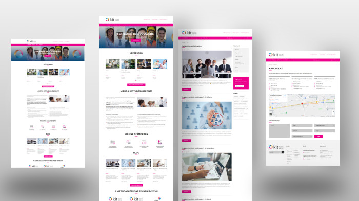
Summary
A good homepage is designed to show within a few seconds that the visitor is in the right place, and to guide them along a clear, trust-building path all the way to getting in touch with you.
This path looks like this:
- They immediately understand what you do
(hero → brand positioning → main message) - They can easily find what interests them
(featured categories → thematic entry points) - Trust and professional credibility start to build
(about section → USPs → client logos and testimonials) - They see real examples and inspiration
(use cases, references, projects) - They get a fast, transparent conversion path
(quotation process → CTA → contact) - They feel that the company is active and up to date
(news → blog → newsletter)
If the homepage builds these sections well and in a logical order, it won’t just look good – it will actually work: bringing more enquiries, better-quality leads, higher trust and a stronger user experience.


