What is web design?
Web design means the design and creation of the interface of websites that appear on the Internet. Web design is responsible for appearance, and web development is responsible for operation.
In the past, web design only played a role in development for desktop computers, but since the mid-2010s, it has also played a role in designing for tablets and mobile phones. This is called responsive web design.
Tartalomjegyzék
- What is web design?
- What does a web designer do?
- What aspects should be taken into account when creating a web design?
- What is good web design?
- How can I see that a website is made with responsive web design?
- The most common web design mistakes you should avoid
- Some general rules for testing responsive web design
- Web design trends in 2020
- The best tools and useful materials for web design
- The best web design blogs worth following
What does a web designer do?
Web designers work on the design and implementation of the appearance of websites. Design concerns the grouping and arrangement of content. Appearance includes shapes, colors, fonts and various graphics.
A web design is good if the website has an aesthetic appearance, is easy to use, simple, fits the given brand and is tailored to the target audience.
The design of most websites is simple, minimalist, so that no external, disturbing information or functions distract the user's attention. The basic goal of the work of web designers is to design a website that wins and keeps the trust of the target audience and excludes all distracting factors.
What aspects should be taken into account when creating a web design?
Nowadays, the graphic design of a website is no longer an artistic activity for its own sake, but a job during which countless aspects are prioritized, including the company's marketing and business goals.
Let's see what other aspects play a role in the appearance of the website:
- Existing image - the web design must match the image of the company
- Trends - web design takes current trends into account
- Industry trends - web design takes into account the appearance of competing websites
- Aspects of importance - during the graphic design of the website, one must strive to display the information to be displayed in the appropriate order of importance.
- Business objectives – the design of the website takes into account the business objectives that you need to achieve. Be it sales, brand building, establishing an expert role...etc.
- Target audience - the web design is adapted to the needs and tastes of the target audience
- Navigation – good web design displays logical and easy-to-use navigation
- Loading speed – fast loading speed must be taken into account when designing the website graphics
- Responsiveness - good web design enables flawless operation regardless of device
- Search engine friendly design – good web design takes SEO recommendations into account
- Content management system - the web design must be designed in such a way that the subsequent website can be easily edited from the content management system
- Consistency - individual pages of the website should have a consistent appearance
- Simplicity, transparency - the web design should prioritize the fast transfer of information.
What is good web design?
Expediency - A good web design serves the needs of users. This can be information acquisition, recreation, communication or business activities. It is important that every page of a website has a clear purpose and provides a solution to a specific need of the users in the most efficient way possible.
Communication - Internet users like to get information as soon as possible, so clear and easy-to-understand communication is important. It is an effective solution if the web design is structured in such a way that the information is organized, the main headings and sub-headings are highlighted, and the text is in bullet points. On the other hand, long, monotonous, and irrelevant websites are not ideal.
Font - In general, "Sans Serif" fonts (eg Arial and Veranda) are easier to read because they have a traditional look and don't have fancy lines. It is worth using a maximum of 3 types of fonts and 3 types of font sizes to ensure consistency of content.
Color scheme - A well-chosen color scheme significantly increases the user experience. Complementary colors convey balance and harmony. Contrasting colors attract the user's eye. Vibrant colors evoke emotions in people, so they should be used sparingly, such as for command buttons or calls to action. Last but not least, the white or negative background gives the website a modern and clean look.
Images - An image is worth a thousand words, so placing an appropriate image on the website can help position the brand and create a connection with the target audience.
If someone does not have high-quality, professional images, it is worth selecting them from stock galleries, because they greatly affect the appearance of the website. In addition, you should consider using infographics, videos and illustrations, because they are more effective communication tools than the best written text.
Navigation - The essence of good navigation is to find your way around the website as easily as possible. Navigation is effective if the website has a menu structure with a logical hierarchy and a maximum depth of 2-3 levels.
In addition, it is worth following the "3-click rule", according to which all information should be available with a maximum of three clicks.
F-Pattern - According to eye movement studies, people scan the monitor in an "F" pattern. The contents on the left, at the top, are viewed the most and the contents on the right, at the bottom, the least.
Instead of trying to direct the user's gaze, the content of an effectively designed website is structured according to people's natural eye movements, so the order of importance starts at the top left and decreases to the right, down.
Loading Speed - No one likes websites that load slowly. Optimizing the size of images, combining program codes into CSS or JavaScript files (which reduces the number of HTTP requests), and minimizing the size of HTML, CSS, and JavaScript can speed up the loading speed of a web page.
Responsiveness - Today, it is common for people to visit websites on devices with different display sizes, so it is a primary concern that the web design is responsive.
If a website is not responsive - i.e. adapted to different display sizes - then it usually needs to be redesigned in order to provide a high user experience to the ever-increasing number of visitors using mobile devices.
What is Responsive Web Design?
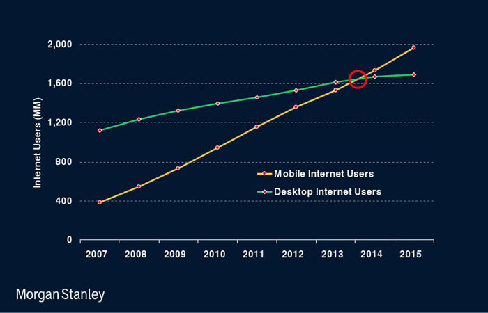
Smartphones, tablets, and laptops have undergone tremendous development in recent years. According to the latest research by Morgan Stanley, as of 2014, more people access the Internet from a mobile device than from a traditional desktop computer.
Despite the fact that the size of smartphone displays is constantly increasing, it is still significantly less than the size of a traditional monitor. In addition, surfing the Internet on a mobile phone is made more difficult by other factors besides the small size of the display. Such disturbing conditions are noise, visibility, e.g. sunlight and continuous movement and vibration.
Another challenge for web developers is the huge variety of mobile devices. In just a few years, dozens of different screen sizes, new operating systems, and new browsers have appeared and spread on the market.
The solution is responsive web design, where the website automatically adapts to the device on which it is displayed, thus providing an optimal user experience.
Responsive web design allows the same website to display perfectly in any environment, regardless of device, operating system, or browser. By perfect appearance, I mean the window size that fits the screen, the font size and contrast for easy readability, the image size that fits the display, and easy navigation.
Responsive web design is nothing more than a website design and development process. In contrast to the creation of a traditional website, the developer has to use a completely different approach during the graphic design period. Since we are designing a device-independent website, the graphic plan is complemented by several plans that show how the page will appear on devices with different resolutions. So we plan several types of layouts and appearances, the technology used allows the website to display a version adapted to the resolution of the device at the moment of publication.
The visitor sees the same website, but in a different form depending on the device he is using.
How can I see that a website is made with responsive web design?
Simply: grab the edge of the browser window and start reducing the size of the window. If the font size, image size and layout are constantly changing as the window is resized, then you are dealing with a responsive page.
The most common web design mistakes you should avoid
1. Immoderate content
Unlike traditional web design, which allows for very easy browsing, cramming too much content on a mobile-optimized page can result in endless scrolling for the user. It is best if you limit the content and leave the most important information at the top of the page for easy readability. Websites with a lot of content, lots of images and videos, tend to load much more slowly, which can then lead to typically impatient users leaving the website.
2. Too complicated navigation
For responsive design to work effectively, you need to make navigation simple and intuitive. Huge hierarchical menu items can spoil the user experience. Designers need to think creatively about how to make different pages accessible while working with small screens; horizontal scrolling and hidden navigation are now commonly used techniques for good UX.
3. Website loading time
The average user is under a lot of pressure for time when searching for information on the Internet. You want to get information even on the go, and slow-loading websites can make you very frustrated. In such a case, it tends not to wait for the page to load, but to go to another website. Thus, a slow-loading website can lose visitors, conversions and revenue from mobile users. That is why it is very important to make your page load quickly and make the information that users are looking for easily available.
4. Using too many unoptimized images
Unlike websites designed for the large display of desktop machines, you must constantly adhere to the requirements of responsive web design by only using images that are essential from the user experience side; otherwise the page will load slowly. In addition, you should also ensure that the images are optimized for small screens.
5. Too much or too little negative space
Portable devices have a wide variety of display sizes that responsive design must cater for. When designing for a small screen, negative space design becomes very important so that the images are visually striking and engaging. Developers should consider how many icons to cram into a group in order not to exceed display size limitations.
Some general rules for testing responsive web design
- Text, controls, and images should be arranged correctly
- Hover and selection states should be highlighted and marked with color
- Make sure the clickable area is appropriate everywhere
- Colors, shading and transitions should be consistent
- Check the correct spacing along the edges
- Text, images, controls and frames should not touch the edge of the screen
- Font size, style and color should be balanced in each piece of text
- Typed text (data input) scrolls properly and is displayed correctly
- The pages should be readable at all resolutions
- The horizontal scrollbar should never appear on the page
- Content that is considered important should be clearly visible at all points
Web design trends in 2020
In addition to the main technological limitations, web designers have less and less opportunities to introduce some variety into the appearance of websites. Nevertheless, trends emerge from year to year that define the appearance of cutting-edge websites for a while. We select some of them below.
- 3D Depth - Apply and combine 3D graphics with photos
- Split screen content - the content displayed on the screen is divided asymmetrically
- Micro animations – images in which smaller or larger parts are animated, thereby achieving a special effect
- Organic shapes - shapes that seem "liquid", curved lines break the page
- Solid color blocks – homogeneous background color blocks divide the screen
- Monochrome appearance - application of images with a monochrome color effect on the website
- Extra bold letters – unusually large, extra bold letters that, in addition to carrying information, also function as design elements
- Collages - a collage of photos and graphics
- Cinemagraphs – cinemagraphs are pictures in which certain parts move continuously and repeatedly
- Hero images – large images that occupy the entire visible area instead of previous sliders
- Parallax design – parallax design refers to content moving on the page at a different speed than the scrolling speed
If you want to read more information with examples about the 2020-2021 web design trends, click here!
The best tools and useful materials for web design
If you are looking for useful materials and tools for web design, we have some tips:
- Creating infographics
- Use Google Image Search to find free images
- Word cloud creation and word cloud generators
- Free online image editing programs
- The best stock photo galleries
- Using moodboards for planning
The best web design blogs worth following
Are you interested in the world of web design? Do you want to read about the latest web design trends? We recommend these web design blogs:
