Responsive means that the website is displayed perfectly on all devices. A responsive website automatically adjusts to the visitor's screen resolution, regardless of whether it is a mobile, tablet or desktop.
In the early years of the web, web pages were developed for a specific screen size. If the visitor viewed the website on a smaller or larger screen, a horizontal scroll bar or huge unused areas appeared.
From the 2000s, along with the spread of mobile Internet, responsive technology appeared, which included procedures that allowed the appearance to adapt to the size and resolution of the display.
Responsive thinking fundamentally defines the design and development of today's modern websites. I will write about this in a little more detail in my article.
Tartalomjegyzék
- The meaning of responsive
- 3 main elements of a responsive website
- What is a responsive website?
- Responsive website testing tools
- What does creating a responsive website mean?
- Advantages of a responsive website
- Responsive website templates
- The responsive grid
- Responsive web page grid setup in Adobe XD
- Frequently asked questions about responsiveness
- Interesting facts about responsive websites
- The history of responsive websites
- Summary
The meaning of responsive
Responsive means that using HTML and CSS technologies, the website's layout and the size of its elements are automatically adjusted to the visitor's screen.
- Responsive technology gives the website a perfect appearance on all devices.
- Responsive behavior is implemented only with the help of HTML and CSS technologies.
- Responsiveness is not a program or a programming language, but a design and development method.
- A responsive website is characterized by easy readability and simple navigation on all devices
Nowadays, we can access the Internet from an amazing variety of devices. In addition to mobile phones, tablets and desktop computers, watches, TVs and even glasses are slowly making this possible. Since screen sizes are constantly changing, it is important that the website also constantly adapts to this environment.
In addition to the size and resolution of the screen, even the orientation and the pointing device (mouse, touch screen) have characteristics that the responsive website must adapt to.
Responsiveness is therefore not a programming language, but a design and development methodology that results in a website that flexibly adapts to the display device.
3 main elements of a responsive website
Responsive operation is basically due to three main functions:
1. CSS media query
With the help of media queries, we can define different styles for different resolutions.
The resolution of the display devices shows such a large deviation that when certain size limits are reached, large-scale display modifications are required. Then we use media queries.
Media queries allow developers to make various style adjustments based on the user's screen size, resolution, orientation, and other properties.
For example, if the available width is below 1024 pixels, then the layout should change from the previous 2 columns to 1 column and the font size should be larger. With this solution, we ensure that the appearance of the website is always perfect.
2. Flexible layouts (fluid grids)
A responsive website not only changes its layout on different resolutions, but also consists of a flexible layout. The flexible layout (fluid grids) means that the website does not need to be designed and programmed for all possible resolutions. This would be an impossible task anyway, there are so many different device resolutions.
In the case of the flexible layout, the individual content parts are automatically resized as the resolution changes, so they can follow the size of the visitor's screen pixel by pixel.
This solution enables designers to create a uniform look at resolutions from to. In addition, they save time and money, since it is enough to design a mobile, a tablet and a desktop version of the website. The task of the web developer will be to determine which of the three will be displayed and at which resolutions.
3. Flexible images
By flexible images we mean a code that prevents images from exceeding the space available.
An image has a certain pixel size, and if it is larger than the container around it, the image will "stretch" the layout and the horizontal scroll bar will appear. We can fix this problem by setting the width of the image to 100%. In this way, it automatically shrinks to the size of the available space.
Since the flexible layouts are automatically adjusted to the resolution, the images in them can follow this change, so the structure of the website and the content stored in it will be responsive.
What is a responsive website?
Web pages that are made with responsive technology are called responsive websites. In other words, regardless of the visitor's device, they look perfect on all resolutions and provide a high user experience.
Today, the majority of web development companies only use responsive technology, but converting old websites to responsive will take many years to complete the transition.
Responsive website testing tools
Not sure if your website is built with responsive technology? With the help of the 7 tools below, you can check in seconds whether your website is responsive and, if so, whether it contains any errors.
- Google Mobilbarát Teszt
- Responsive Web Design Checker
- Pixelemu
- Am I Responsive ?
- Responsinator
- Website Responsive Test
- Designmodo Responsive Test
Testing the responsive website before going live
Every day, we come across countless website errors on the net, which could have been avoided if the developers had subjected the website to a thorough test before going live. This testing also has its own process, you can find detailed information about it here.
What does creating a responsive website mean?
Responsive website creation means the application of a design and programming methodology that is used to create today's modern device-independent websites.
From 2015, with the officialization of Google's responsive guidelines, testing and ranking, it became clear that responsive website creation is the basis of future web development.
Responsive website design
You can read an exhaustive article about the design of responsive websites here.
Responsive website quote request
In order to create a quote for a responsive website, we usually need the following information:
- What does your company do?
- What is the purpose of the website to be created?
- Do you already have a website? What do you need to know about it? What are you not satisfied with?
- Who is the target audience of the website?
- Does your company have corporate identity?
- Have you prepared a draft for the menu items on the website or can we help you put it together?
- What functions do you want in the website?
- How many languages will the website be in?
- Can you show me some competing sites?
- Can you show me some websites that you like?
You can find a sample for requesting a quote for a responsive website here.
Advantages of a responsive website
1. More visitors from mobile
According to international statistics, as of 2015, more people view the top American websites from mobile than from desktop computers. In domestic terms, although we are somewhat behind, it is almost certain that a few years later we produced similar statistics.
As a result, it is extremely important for companies that their websites are also displayed perfectly on mobile devices. Otherwise, the mobile visitor will leave the page and continue browsing on the website of a competing company.
After switching to a responsive website, the number of mobile visits will clearly increase and these visitors will spend more time on the site.
2. Improved rankings in Google
Another big advantage of responsive websites is better Google ranking. As from April 2015, the existence of responsiveness is included in the evaluation of the rankings, those companies that acted on time achieved better positions.
If your website is not responsive, Google ranks it lower in the search results. Google's move is understandable, as it wants its mobile visitors to list websites that are easy to use, and that requires responsiveness.
3. Faster website development
Before responsiveness, it was common practice for companies to create two separate websites. One for desktop users and one for mobile users. However, it is much more difficult (and more expensive) to develop two separate websites than to create a single responsive site that serves all devices.
That is why the responsive solution means a clear cost reduction compared to the previous separate desktop and separate mobile website.
4. Lower operating costs
Before the advent of responsive technology, a mobile-optimized solution was the development of a mobile website separate from the desktop version. The maintenance, updating and operation of two separate websites (mobile and desktop) naturally requires twice as much work, costs and time as if the same thing had to be done on a responsive website.
With the advent of responsive websites, instead of two websites, only one has to be maintained, developed, and updated, and the time and costs thus saved can be spent on content development and marketing.
5. Making website analytics easier
If you have two separate websites, one for desktop users and one for mobile users, then there are two separate visitor statistics. This means that you need two Analytics accounts, two thank you pages, two copies of the landing pages, i.e. two of everything.
A responsive website brings everything "in one hand", so you can see all visitors in one analytics account, regardless of whether they come from a mobile, tablet or desktop. You don't have to comb the data, you don't have to prepare the reports twice, because this problem is solved with responsiveness.
6. Lower bounce rate
The bounce rate shows the percentage of visitors who leave the site without clicking on another page.
If your website does not fit perfectly to the visitor's screen, the user experience will be poor, the visitor will find it difficult to navigate, orient himself, read the page, lose patience and click away after a while. According to statistics, a poor user experience greatly increases the bounce rate, which is not surprising, since no one likes to browse a site that is difficult to use.
A responsive website solves these problems, as it provides a high user experience at all resolutions, no matter what device the visitor uses. The navigation will be easy to use, the texts will be easy to read, you only have to scroll in one direction, so the visitor will enjoy spending time on the website and it is likely that sooner or later he will become a customer.
7. Higher conversion rate
A longer time spent on the site and a lower bounce rate are the first steps towards increasing the user experience on the site. A higher user experience helps to build trust and commitment, which sooner or later is embodied in conversion, i.e. the visitor will make a purchase, subscribe to the newsletter, contact your company.
The conversion rate of the average mobile user is 64% higher than that of a desktop user, which is why it is important that your website is responsive.
8. Higher user experience
As I wrote in the previous points, a responsive website provides the visitor with a better user experience. User experience is made up of many factors: navigation, readability, design, quality of textual content, quality of images...etc. Responsiveness itself is responsible for several of those listed here, which is why its existence is an extremely important aspect.
If the website flexibly adapts to the given resolution, the navigation fits on the screen, the texts are easy to read, and the buttons are the right size, then the visitor will be happy to stay on the page and more likely to become a customer.
Responsive website templates
In the list below, we have collected some reference responsive website samples.
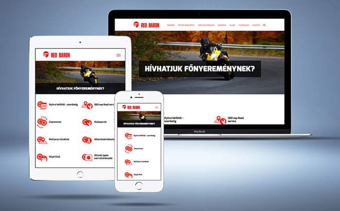
Website developed for Red Baron:
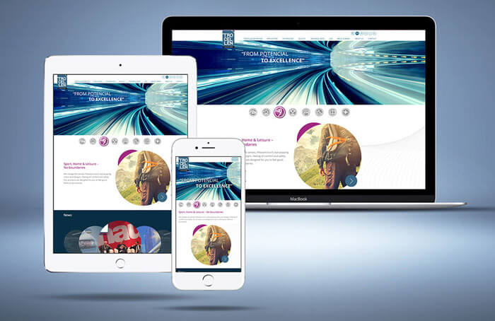
Responsive website developed for Trocellen GmbH:
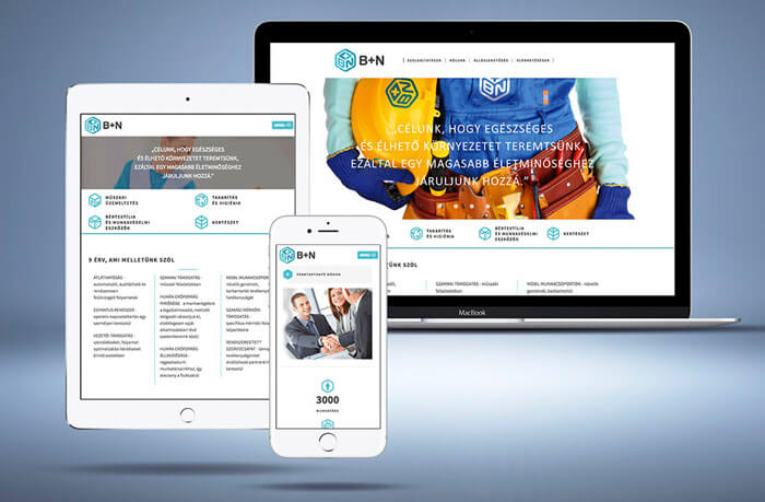
Responsive website created for B+N Referencia Zrt:
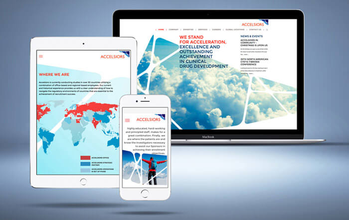
Responsive website of Accelsiors:
The responsive grid
Responsive grid is a design system that helps in responsive website design.
During the graphic design of the website, if we adjust the individual elements to the responsive grid, this allows the website to adapt flawlessly and flexibly to the screen size of the visitor's device (mobile, tablet or desktop).
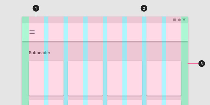
The responsive grid consists of the following elements:
- Columns
- Space between columns (gutters)
- Margins
1. Columns
Columns divide the content of the website into parts of equal width. In the case of websites designed for Full HD resolution, we usually divide the area occupied by the website into 12 columns, in the case of tablets and mobile phones, into 4-6 columns.
The responsive behavior of the columns can be easily programmed on a smaller screen size, so if the individual content elements are adjusted to the edges of the columns during the design, the website will appear flawlessly on both tablets and mobile phones.
2. Space between columns (gutter)
The gutter is the space between the columns. This helps to keep distance between individual content pieces.
3. Margins
Margins are the distance between the content and the edge of the screen on the left and right sides.
A practical guide
The current screen resolution statistics ( statcounter.com/screen-resolution-stats ) can help you determine what resolution the website should be designed for.
Based on these, we create a plan 1920 pixels wide, within which the content part occupies 1170 pixels. This way, the website with the scroll bar on the right can fit at a resolution of 1200 pixels. This means that the visitor gets the same look from full HD to more popular laptops.
From the most popular news portals to the professional templates available for purchase, the majority use this scaling. In practice, this looks like this:

- From a total width of 1920 pixels, 360-360 pixels fall on the right and left sides to reach a content width of 1200 pixels.
- From these 1,200 pixels, a margin of 15 pixels on both sides comes down. Marked in blue in the picture.
- The remaining 1170 pixels are divided into 12 pixels. 70 pixel wide columns with a 30 pixel wide gutter between them. Here you can see the basis of the calculation, and you can also download the Photoshop grid corresponding to this allocation: gridcalculator.dk/#/1200/12/30/15
If we want to go from the 1200 pixel resolution to one larger size, I recommend the following allocation for the 1366 pixel content part ( gridcalculator.dk/#/1366/12/30/20 ):
- Total content width: 1326 pixels
- Number of columns: 12 pcs
- Width of columns: 83 pixels
- Gutter width: 30 pixels
- Margin on the right and left (above the content width of 1326 px): 20 pixels each
After that, by adjusting the content elements of the website to the edges of the columns, we get a website with a uniform appearance, appropriate proportions and, above all, responsive programming.
More information about responsive design:
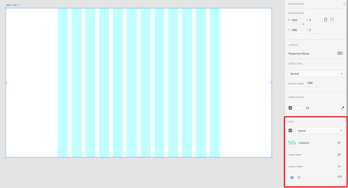
Responsive web page grid setup in Adobe XD
To design a responsive website in Adobe XD, it is advisable to choose a 1920 pixel wide artboard (Web 1920).
On the right toolbar, in the GRID section, the Layout grid type must be turned on and the following values must be entered (see the picture!)
- Columns: 12
- Gutter Width: 30
- Column Width: 70
- Linked left/right margins: 375
Since the setting of each parameter also affects the others, it is advisable to start from the bottom, by specifying the margins, and proceed from there to fill in the column and gutter.
Frequently asked questions about responsiveness
How can I make my website responsive?
In the case of old, design-outdated websites, I usually recommend that it is advisable to connect the transition with a design change, because the design itself does not in most cases allow for a perfect responsive implementation.
In the case of less outdated websites, a web developer can solve the responsive conversion, but it still requires more checks and testing than if we had thought responsively from the beginning of the design.
How do I know if my website is responsive?
Countless responsive testing tools are available on the web, but the easiest way is to call up the site on a mobile or tablet, go through all the menu items and see if it behaves properly in terms of appearance and operation.
Unfortunately, it happens that a website that the developer says is responsive still produces errors on certain devices, which results in an "invisible" loss of visitors and can only be filtered out with thorough testing.
How can I make my WordPress website responsive?
Converting WordPress websites to responsive is not much different from converting other websites. But if you're thinking about using a template, it's advisable to carefully check whether the template you're looking at behaves perfectly on all resolutions, because it's difficult to correct errors afterwards.
Interesting facts about responsive websites
If you are already aware of what responsiveness means, here are some interesting facts that confirm why the use of responsive websites is essential.
- More than half of global internet traffic comes from mobile devices. In fact, already in 2017, mobile devices accounted for 52% of all internet traffic. This ratio continued to increase this year as well, and we will certainly see an increase next year as well. In other words, if your website does not work perfectly on all screen resolutions, you may lose more than half of your visitors.
- In 2017, half of online purchases were made from mobile devices. The data comes from the United States of America, but the same trend can be seen in our country as well. In addition, as the proportion of mobile devices within all internet traffic increases, we can logically conclude that the proportion of purchases will also develop similarly.
- Almost 60% of Internet users use their mobile device to search for the seller before making a purchase. If your website does not appear properly to users, they will conclude that you are not trustworthy. "After all, who doesn't have a well-functioning website in today's world?" - the user might think. And he is right!
- 80% of customers immediately leave a website that does not display perfectly on their mobile device
- According to Google, 60% of users never return to websites that they had trouble browsing; and 40% visit competitors' websites
- According to Google research, 83% of users consider it important to be able to browse a website smoothly from any device
- The conversion rate on mobile devices is 64% higher than on desktop computers
- Almost a quarter of businesses with a website do not have a responsive website at all
The history of responsive websites
In the early 2000s, designers began to think about a solution that allowed the website to adjust to the width of the browser window. Since then, responsive technology has become not just a passing fad, but an industry standard.
Ethan Marcotte had a big role in this, who in 2010 published an article entitled "Responsive Web Design" in the online magazine A List Apart. This is where the term "responsive design" was first uttered, which then quickly swept the entire industry.
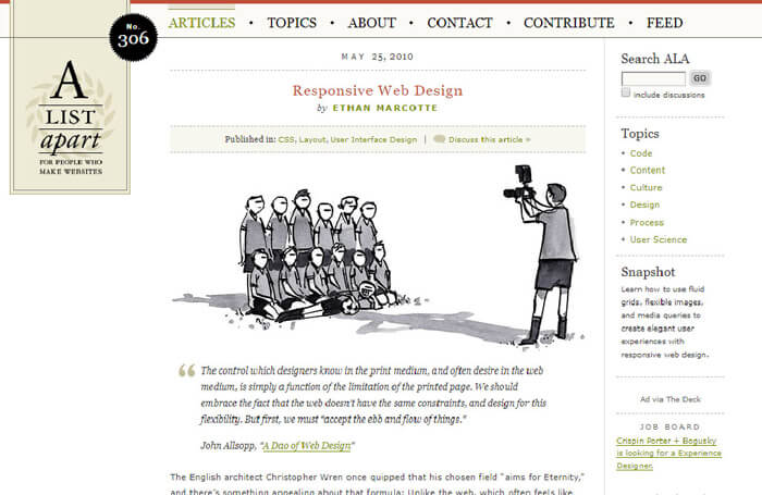
In his article, Ethan Marcotte described a new type of formatting for HTML documents, which made it possible to optimize the appearance of the website for any display size and resolution. The basis of this technique was the use of a flexible structure (fluid grid), flexible images and media queries.
With the exponential growth of mobile internet, responsive design and development has become more and more popular. In 2015, Google introduced a change to the "Mobilgeddon" algorithm, which takes into account the responsiveness of websites when determining rankings. From there, there was no stopping, as those who wanted to achieve good rankings in Google and did not yet have a responsive website were clearly forced to move in this direction.
According to statistics, October 2016 was the turning point from which mobile internet usage increased globally over desktop internet usage. In other words, more people used a mobile than a desktop computer. Let me quietly note that this data should not be applied uniformly to the entire web since then, because the industry, and often even its service or product, chooses the proportion of a given website viewed from a mobile or desktop computer.
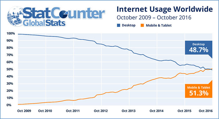
The website's visitor statistics, however, clearly show how this desktop / mobile ratio developed in the previous period. Based on these numbers, it is worth investing more or less energy in the development and testing of responsiveness. If the proportion of mobile visitors is over 60-70%, the mobile-first design approach should be followed.
Summary
Responsive means a website design and development method that can be flexibly adjusted to the visitor's display. A website adapted to the visitor's display is easy to manage, easy to navigate and read, in a word, it provides a high user experience that fills the browsers with satisfaction. And it is easier to build trust and commitment in a satisfied visitor, as a result of which sooner or later they will become our customers.
