Typography facilitates the easy readability of the textual content appearing on the website and the quick absorption of the information it carries. Website visitors these days don't read, they scan. Scanning means that we go through the majority of the huge amount of information that appears on the web and read only the parts that interest us in detail.
In order for the content of the website to be scanned quickly, the text must be divided into smaller and larger units and the individual parts must be labeled. Titles help the visitor decide whether the corresponding content is worth reading.
The well-structured textual content enables the reader to receive information conveniently and quickly. Accordingly, typography uses fonts and font families to create a written image that not only provides the viewer with an aesthetic experience, but also promotes easy readability.
During our website screenings, one of the areas to be examined is typography, and even more so the readability of the content, since according to statistics, content in small print, difficult to read, is one of the main reasons for leaving the page.
Just as Internet technologies, content consumption habits, and the tools used are constantly changing, so the rule system of web typography is not permanent either, and is constantly adjusted to current trends.
Typographic trends
According to a comprehensive report by smashing magazine, the character size of headlines has undergone a significant increase in recent years. The average uses headings between 20-32 pixels, but some pages often use significantly larger sizes.
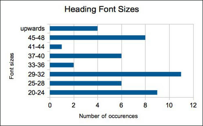
Optimal character size
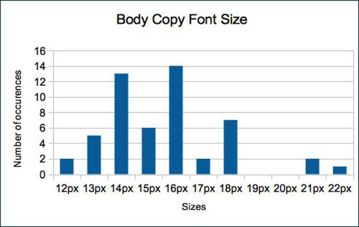
The character size of paragraphs shows a similar growth trend. The previously typical 12 pixel size has recently increased to 12-14 pixels, but interestingly, the 16 pixel character size is at least as popular as 14!
Optimal row height
The line height should always be compared to the character size, so we should not calculate it with an absolute value, but with a ratio. Classic typography mentions a multiplier of 1.5 as the optimal line height. This means that with a character size of 14 pixels, you should choose a line height of 21 pixels for easy readability and an aesthetic appearance.
Spacing between paragraphs
According to the study, the average distance between paragraphs is 1.39 times the line height. So, for a line height of 21 pixels, you should choose a distance between paragraphs of 29 pixels.
How many characters should be in a line?
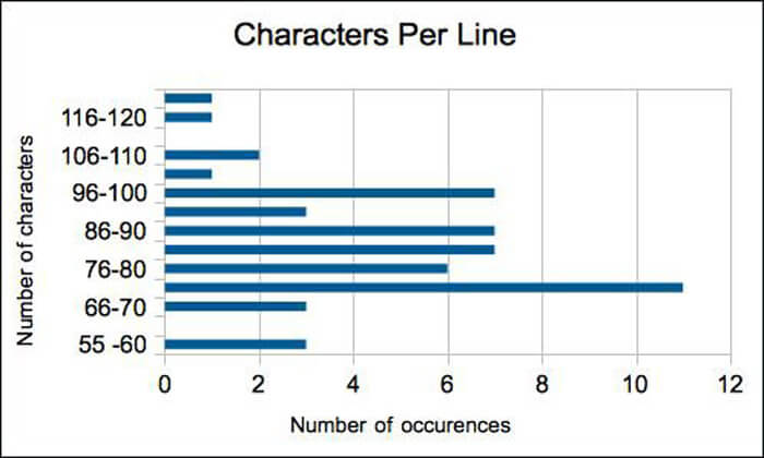
According to the classic typographic rule, each paragraph should be optimally 55-75 characters long. However, current web trends refute this value: according to the study, the average line length is 83.9 characters for the examined websites.
Summary
The appearance forms of web content are constantly changing from year to year. This change is fueled not only by current fashion, but rather by content consumption habits. More and more of us access the Internet from some kind of mobile device, and these devices have many characteristics that fundamentally affect the structure and typography of the textual content.
The numbers mentioned in the article should not be considered as binding, rather they give guidance on the direction in which typography is changing today and what aspects should be taken into account when designing a website.
If you have doubts about whether your website is up-to-date in relation to the guidelines described here, I recommend an audit, which, among other things, sheds light on such deficiencies.