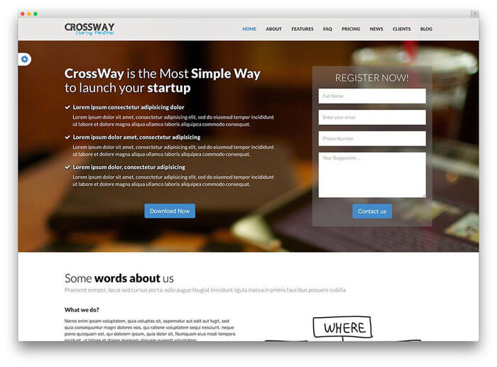
Many people do not know at all what we are talking about when we talk about a landing page, landing page, or landing page. It's very simple though. A website is a landing page if a visitor arrives from an external link. If we look at it from a marketing point of view, then we only mean those pages that are mostly separate from the website of the company that created them.
Tartalomjegyzék
There are two main types of landing pages
- The purpose of the site is for the visitor to make a purchase. The order can be placed on the landing page itself for a single product or service. However, if we advertise a range of products, links can also be included on the landing page, each of which leads to a product page.
- The purpose of the site is lead generation. In such cases, visitors to the website can enter their e-mail address, name and other information so that we can contact them later with an offer. Of course, in this case, the visitor has to be offered something in order to provide their data. For example, you can try our service for free for 30 days or download an e-book
How should the landing page be structured?
The title should be attention-grabbing
Everything starts with the title, this is the starting point of the entire landing page. The title should be interesting and attention-grabbing. Our proposal:
- consist of a maximum of 8-10 words
- be to the point
- arouse the interest of visitors
Get to the point
Users have little time, their attention wanders, and they skim through websites while looking for the information they are interested in. They come to a landing page with a definite goal, so their attention must be directed to the essential information! The message should emphasize the benefits that can be provided to the user, point out how we are able to solve their problem. For this purpose, our headings and sub-headings should be clear, use bulleted lists, use highlights and limit ourselves to the essence. It can take the form of a description, presentation, or video, but the most important thing is to be straight and honest!
Use of images
A picture is worth a thousand words and the brain processes it much faster than text information. That's why it's a good idea to use as large images as possible on our landing page, and these images should be related to the product or service, and they should definitely be of high quality.
The call to action (CTA) should contrast with the rest of the page!
Our call-to-action button/link (CTA) needs to stand out, and the easiest way to do this is to make it stand out with a bright, contrasting color. At the same time, it is recommended to use restrained colors on the page, thereby giving greater emphasis to the CTA button.

Logo
In order for users to know where they are, we always place our logo on the page. Always be visible for quick identification. If you have several landing pages, it is worth placing the logo at the same point on each page.
Emphasis on benefits
Why is the product or service attractive to customers? This must be stated in a prominent place on the page. The customer should be at the center of this as well, it should be formulated from his perspective.
Recommendations
Trust is the most important thing, so ask your existing customers to say a few sentences about your product or service, which you can then place on your landing page. Testimonials must come from real people - with names and pictures - from people who best represent your target audience. They do not contain generalities, but specifics.
Find the golden mean
At first hearing, it might seem like a good idea to make your landing page stand out with original visuals, but practice and A/B tests show that it achieves the exact opposite effect. Using very unique visual elements will confuse the user and thus reduce conversion. It may even happen that, for example, the use of excessively large images or other impressive graphic elements slows down our site.
Format the page
Certain elements of the landing page, such as the title line, the subtitle, and the text, should be clearly identifiable for users, thereby facilitating their orientation on the page.
Social media
We always include social media links on our site, which increase our credibility.
Contacts
Make it easy for visitors to notice. An address and a phone number also prove that it is a working company.
What not to do on the landing page - typical mistakes
Menu bar
One or even two menu lines - while completely natural and common on a website - are extremely confusing on landing pages. What does a menu offer? Countless opportunities for the visitor to click! He watches and in a careless moment navigates away, while we have not even introduced him to the point.
Long forms
With these, we run the risk of users leaving, even during the filling process. The more fields to fill in, the greater the chance that the user will abandon our form. Therefore, it is advisable to keep it as short as possible and to request only the most necessary data from the user.
Too many options
All links and menus that could divert the visitor must be removed from the landing page, and on the other hand, they must not be confused by the fact that they fulfill multiple purposes. This always causes confusion and reduces efficiency. The landing page should always be aimed at a single goal, the CTA button should not be multi-directional, or even aimed at one goal, but with several versions. At the same time, it can appear on the page several times, and its optimal placement also depends on the content. The landing page is a one-way street!
Landing page related to advertisements
When we optimize our landing page for a Google Adwords (or Facebook Ads) campaign, the effectiveness of our ad will improve in several ways. On the one hand, the quality index of our ads will improve, and on the other hand, our conversion rate will increase, resulting in increased revenues. It is therefore worth creating a suitable landing page for each campaign.
What is the most common mistake you can make?
If the ad does not direct you to a landing page related to the campaign, but to the main page of the company. This follows from the fact that we don't have the money, time and desire to even create a landing page, especially after we've already put it together and spent a lot of money on the campaign itself. It is essential to understand that efficiency is lost! A visitor to the main page will not convert. Do you pay for it to come to you, but you just let it get lost there and not order anything? Because that's what you get if you direct it to the main page. He will be disappointed, because he came for a well-defined goal, which he should be searching for instead, so you put obstacles in his way. You will lose it.